

Relative Performance List Leans Negative
Just a few stocks are keeping up with the S&P 500
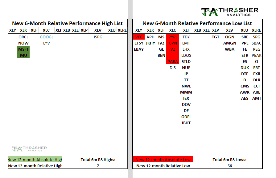
A section of the letter each week will takes a look at the stocks making new 6-month highs (on the left) and lows (on the right) relative to the S&P 500. This list will be of large cap stocks and grouped based on their sector. If it's making a 6-month AND a 12-month relative high (or low) then it'll be shown in green (or red) and if it's a new 12-month absolute new high (price) then it will be in bold. This type of scan be useful in seeing what stocks are showing strength as well as which sectors have the most stocks making relative gains. We can also get insight into the breadth of the market based on whether there are more new relative highs or lows each week.
Last week the list of new 6-month relative performance lows expanded from 49 to 56 while the new high list dropped from 18 to 7. This isn't the type of price action you'd expect with several major indices (Nasdaq 100 and S&P 500) hitting multi-month highs. Last week I wrote about the lack of strong performance for the average large cap stock relative to what the Index was doing. In the table below we can see a closer look at just how biased the relative performance data is towards stocks under-performing compared to those keeping up with the Index.
The new relative performance high list is essentially just a few tech stocks and a stray health care stock. Google and Microsoft have accounted for a large bulk of the YTD gains in the S&P 500 as mentioned in last week's note.
To receive the full Thrasher Analytics letter and gain access to the proprietary models, research and data shared each week, visit: www.ThrasherAnalytics.com
Disclaimer: Do not construe anything written in this post or this Substack in its entirety as a recommendation, research, or an offer to buy or sell any securities. Everything in this post is meant for educational and entertainment purposes only. I or my affiliates may hold positions in securities mentioned.