

Risk Appetite
How Risk Appetite Data Can Be Used to Evaluate the Stock Market
The Risk Appetite chart is one shared every Sunday with Thrasher Analytics subscribers. Below I discuss the construction of the chart, and several methods of how this data can be read and used. It can help subscribers see when the market is shifting into a ‘risk off’ environment as well as when the market internals are suggesting ‘risk on’ is the dominate force.
Risk Appetite Construction
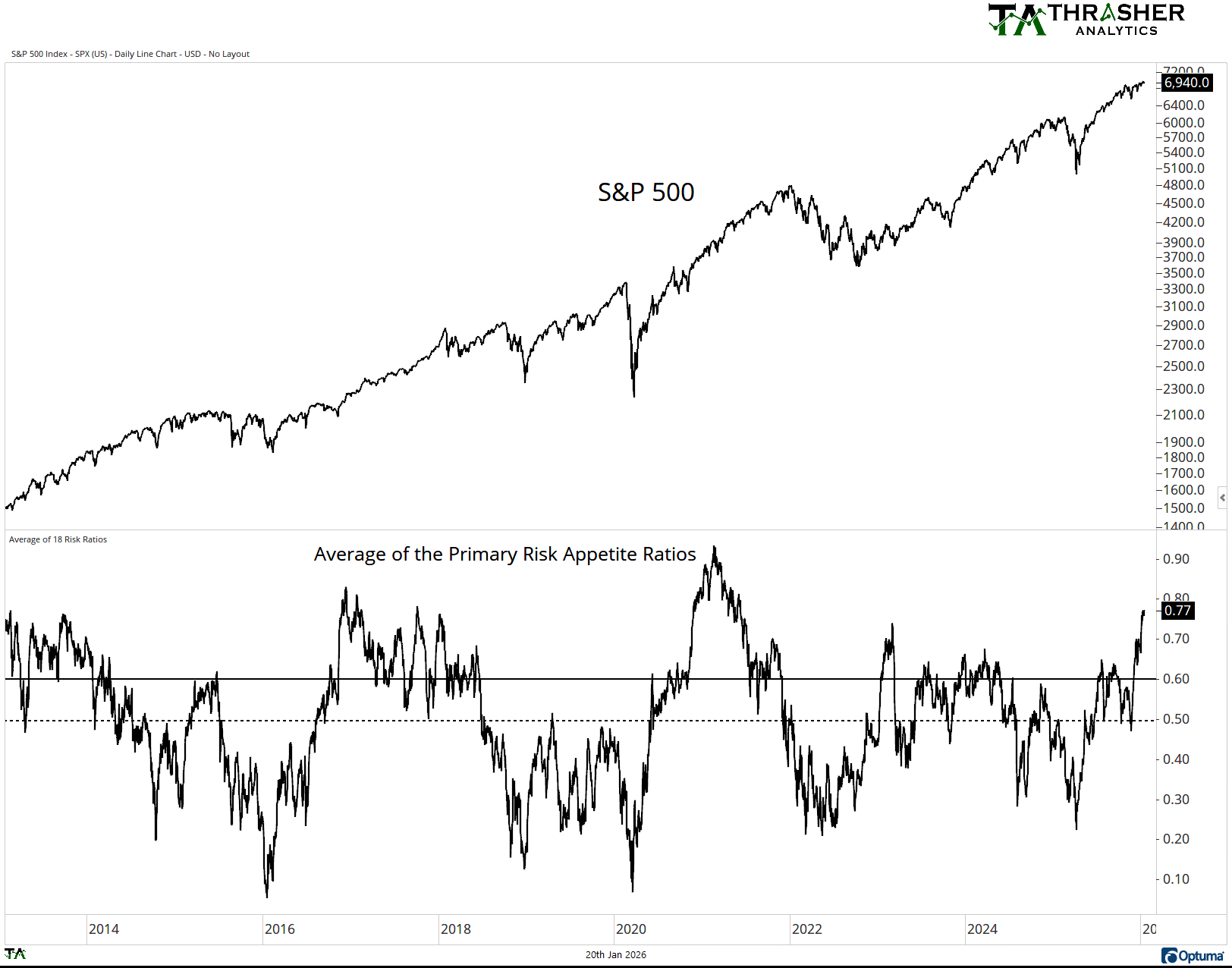
The Risk Appetite Index I share every week takes an average of 16 key ratios I believe provide insight into ‘risk on’ or ‘risk off’ nature of the equity market. The individual ratios are shared in the Sunday letter but include growth vs value, small cap vs. large, performance of semiconductors, banks, and home builders, among others.
These ratios are evaluated on a one-year lookback period. These percentiles are then averaged, and the chart below is produced. The resulting number is the average percentile. Currently at 77, the average of the 16 is at the 77th percentile, a positive sign for risk appetite.
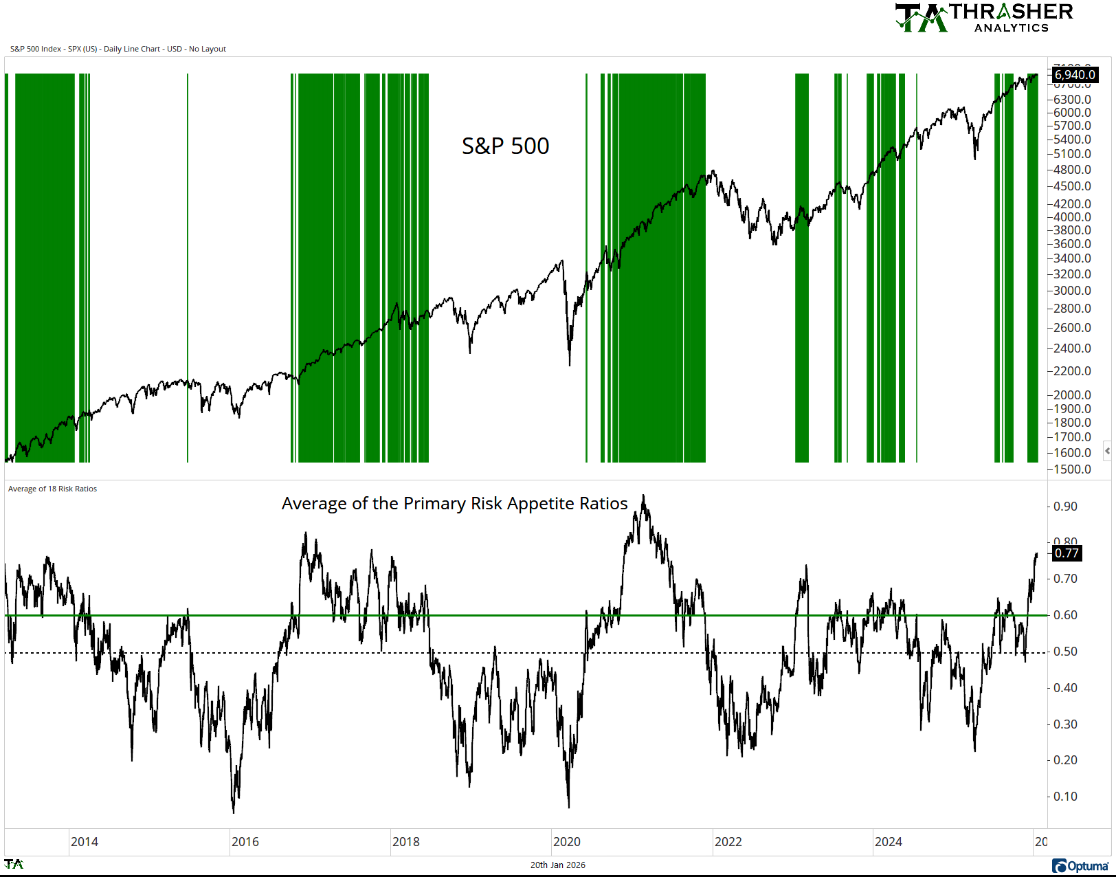
When Risk Appetite is High
When the average of the ratios of one-year percentiles is elevated, meaning above 60 (marked by the green bars), the S&P 500 often continues to move higher. It’s when the Average of the Risk Appetite Ratios falls south of 60 or 50 do we start seeing the S&P 500 under pressure. This doesn’t mean there haven’t been small pullbacks like during the uptrend in 2023 and 2024 when Risk Appette was high. But note the Average Risk Appetite going into the highs of 2018, 2020, 2022, and 2025. All were under 60.
When Risk Appetite is Low
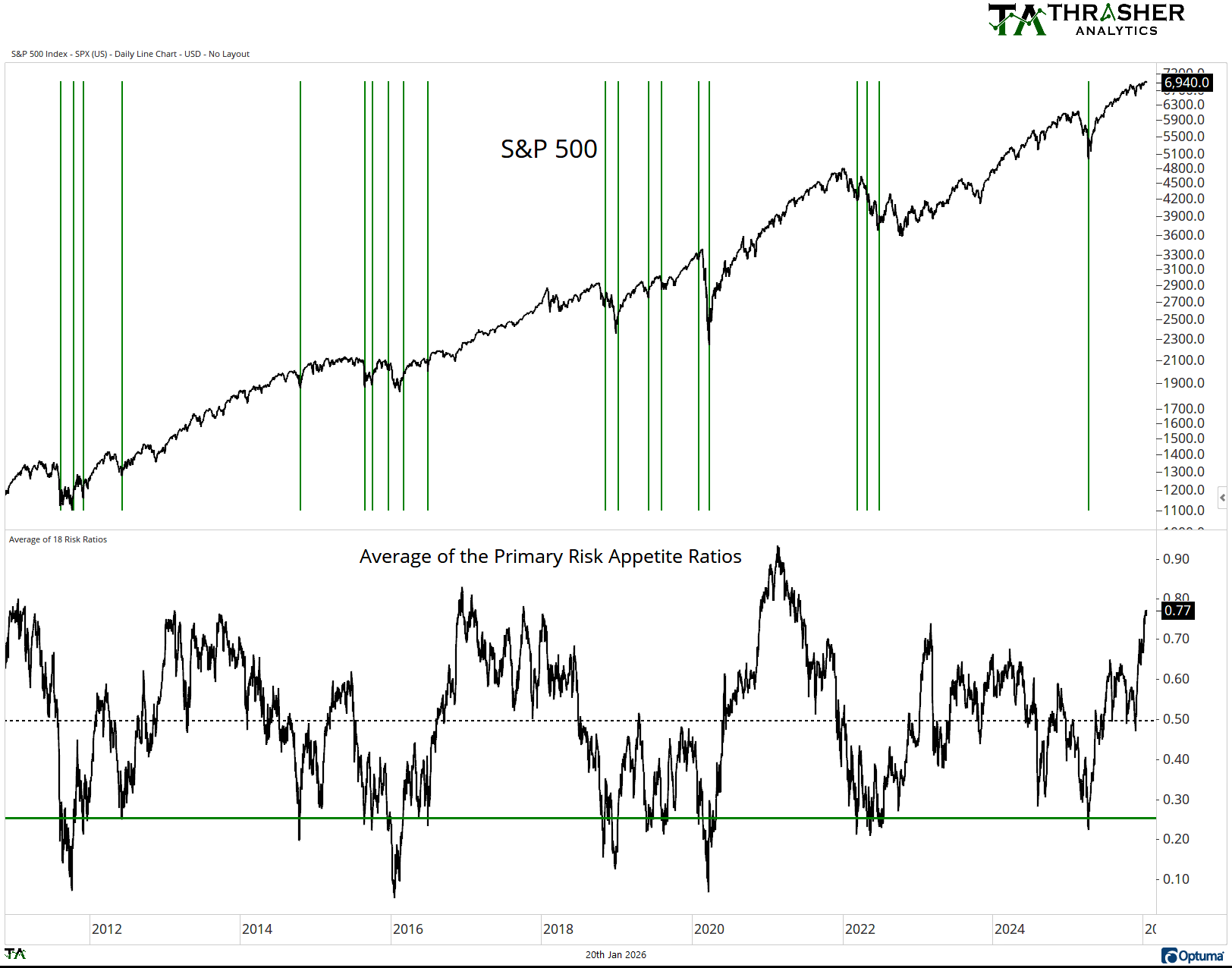
The next chart I’d like to share is when Risk Appetite begins to improve from low levels. This chart has green lines when Risk Appetite moves above 25. This means the average risk ratio has been in the bottom one-fourth of its annual range and has begun to improve. This is an aggressive way to evaluate risk appetite, as it can whipsaw back and forth around 25 like we did in 2022.
Looking at the market return following these instances since 2010, the S&P was higher 75% of the time 10 days later and 85% of the time one month later. With a median return of 3.47% 10 days later and 3.9% one month later. This is compared to the median return of the S&P for all periods of 0.79% over 10 days and 1.59% over one month.
When Risk Appetite Gets back to 50
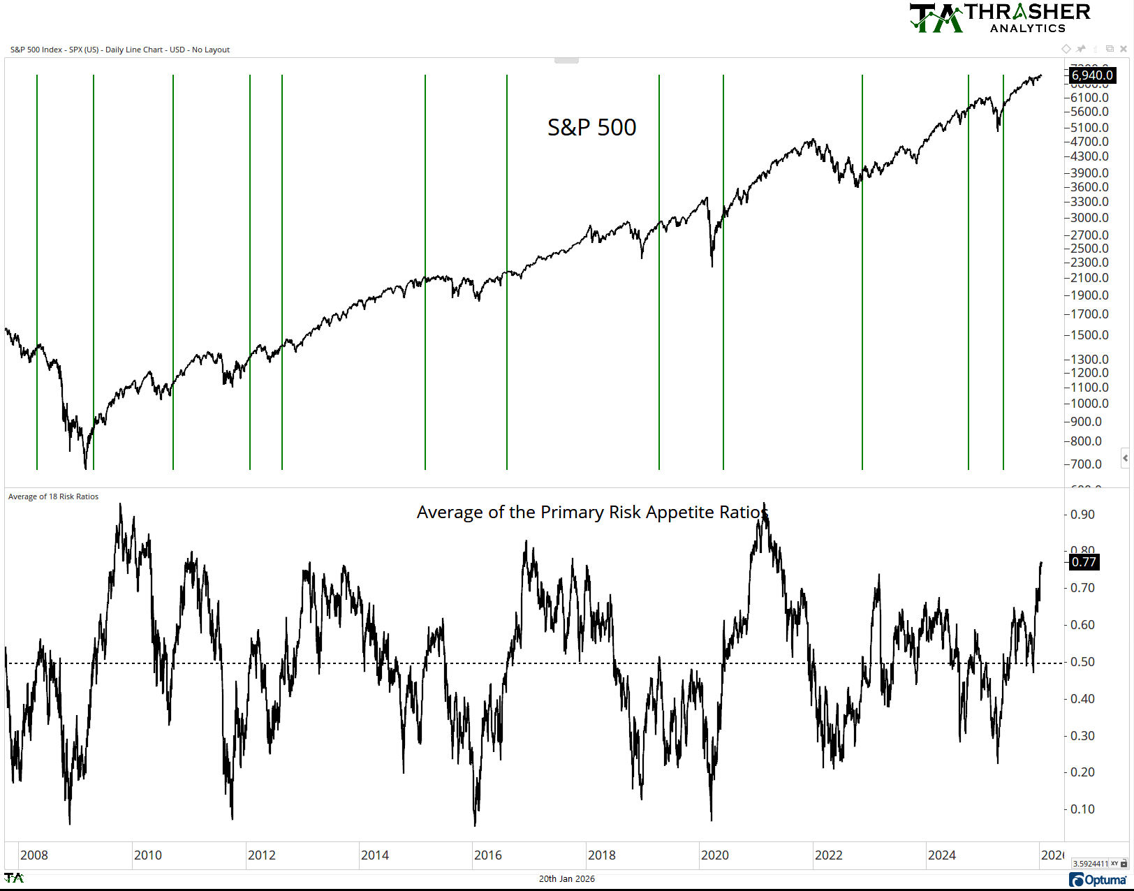
A more conservative approach to Risk Appetite is when we see it move from the bottom third (under 33) to the midpoint (50). This type of change is shown in the following chart’s green lines. Here we see it occurring after the final lows of most down trends like recently in April ‘25 and after the low in 2022. However, this method can have more lag when the Average falls into the teens like it did in 2011 and 2018. In these cases, the SPX saw quite a bit of recovery before the Average Risk Appetite Ratio got back to 50.
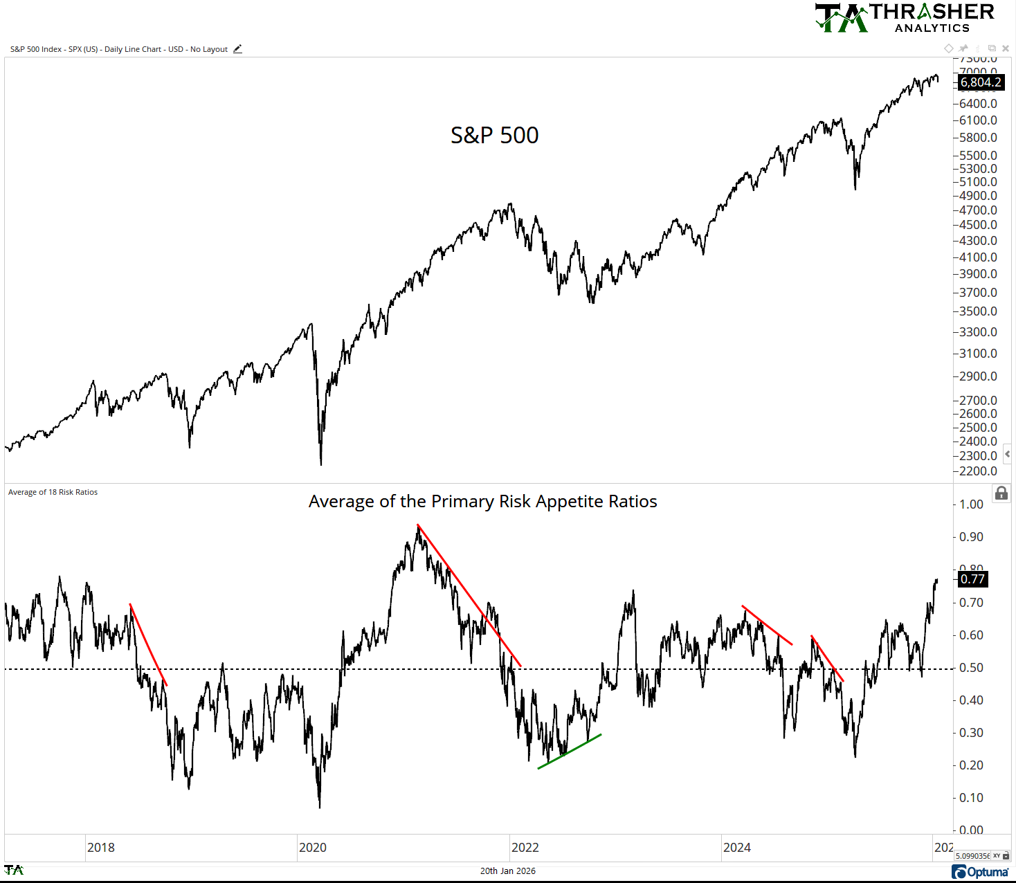
Risk Appetite Divergences
The final way to use Risk Appetite is when it divergences from price. When the S&P 500 is making a new high, but Risk Appetite is making lower highs, this tells us the market is shifting internally from being less ‘risk on’ to more ‘risk off’ based on the performance of other assets. This type of divergence occurred prior to several major highs in the Index. The opposite can also occur when the S&P 500 makes a lower low, but Risk Appetite is improving. This was a major bullish development at the 2022 bottom.
Risk Appetite is an excellent tool to evaluate the equity market and get a look at how other assets from commodities, currencies, size, factor, sector or industry are performing and what that means for the overall market.
No reproduction, transmission, or distribution permitted without consent of Thrasher Analytics LLC ("Thrasher Analytics"). The material contained herein is the sole opinion of Thrasher Analytics. This research has been prepared using information sourced believed to be reliable. Such information has not been independently verified and no guarantee, representation or warranty, express or implied, is made as to its accuracy completeness or correctness. It is intended for the sole use by the receipt to whom it has been delivered to by Thrasher Analytics. The delivery of this report to any person shall not be deemed a recommendation by Thrasher Analytics to affect any transaction in any securities discussed herein. For more information, please refer to the Disclaimer/Terms & Service page of our website.